
Following the conclusion of the 26th Conference of the Parties (COP26), much has already been written about its achievements and disappointments. Consensus appears to be it was a partial success, which keeps the possibility of limiting temperature rises to less than 1.5°C (just) alive. Rather than re-tread detail well covered elsewhere, I thought it would instead be interesting to highlight some great charts that encapsulate why the 1.5°C figure is such a key focus, and why COP26 and future COPs genuinely matter.
- Human Activity is causing global temperatures to rise
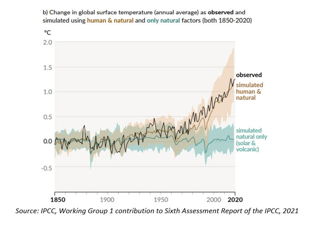
The Intergovernmental Panel on Climate Change (IPCC) is a body of scientists convened by the United Nations. The chart below, produced by the IPCC, simply points out that observed temperatures are about 1.1-1.2°C hotter than they were before the end of the industrial revolution (1850). That warming hasn’t been caused by natural activity such as solar cycles or volcanic activity. All evidence points to it being caused by human activity.
2. Why limiting temperature rises to 1.5°C is important
The last COP21 held in 2015 resulted in the Paris Agreement, which aimed to limit global warming to “well below 2°C” compared to pre-industrial levels. Current efforts, including COP26, are focusing on limiting the rise to 1.5°C (remember, we’re already at least 1.1°C so that leaves only an additional 0.4°C ‘headroom’).
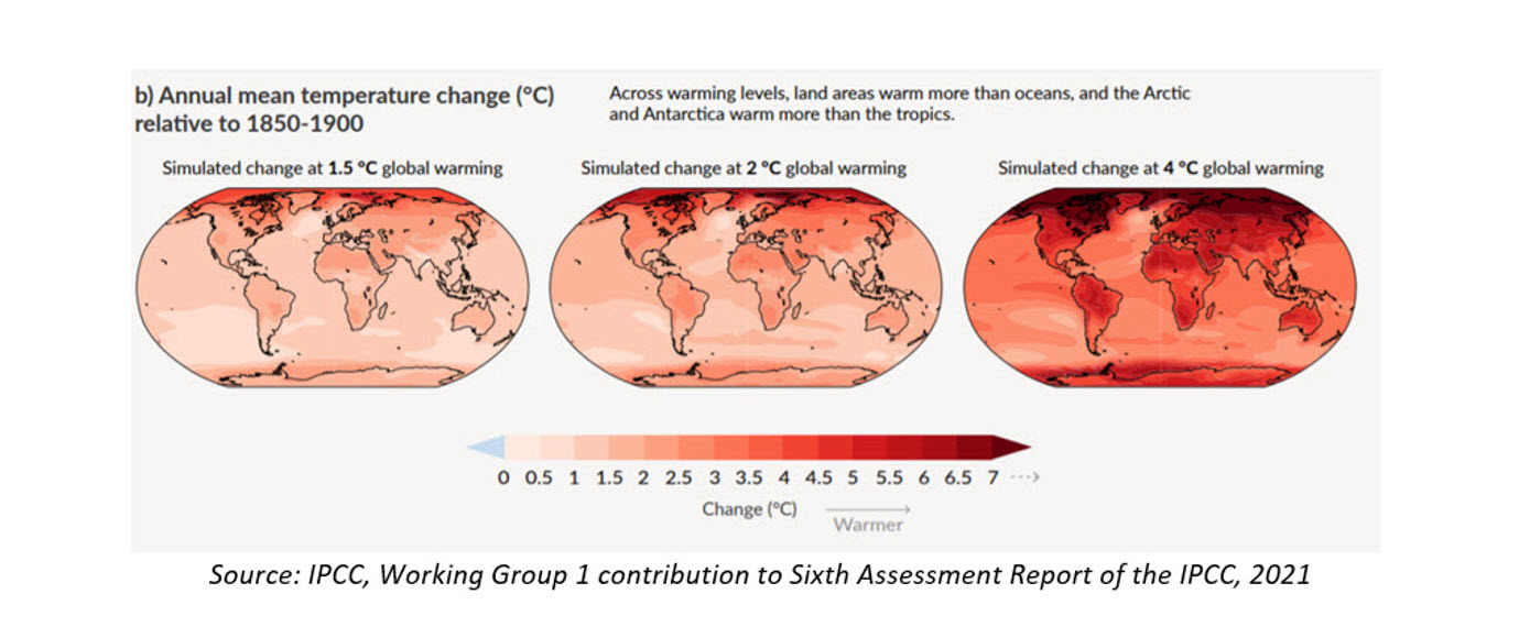
Limiting temperature rises is important because, although an average rise of 1.5-2°C doesn’t sound like much, in practice not everywhere will experience the average, with large variations around the average having even greater consequences in the form of extreme weather (droughts, floods, storms etc).
3. The politics of getting agreements to decrease CO2 emissions is hard
Much blame in western media has been levied at China and India for watering down the language at the end of COP26, altering a commitment to ‘phase-out’ coal to ‘phase-down’ its use. This tension between developed and developing nations isn’t new, however, and fits a well-worn pattern. We often hear that the biggest emitter of CO2 currently is China with the US second. This is true, but it ignores the fact that China has a much larger population than the US. On a per-capita basis, China emits far less CO2 than the US and emerging economies are generally far lower emitters on a per capita basis than developed countries.
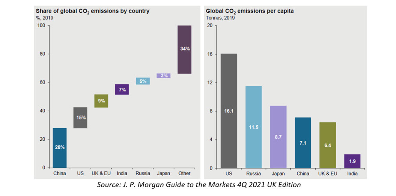
Not only that, but you should also consider historical emissions. In terms of which countries have emitted the most historically, the US leads the way. Developing markets argue that those who have emitted the most historically (and got rich doing so) should bear the greatest burden of the costs of decarbonising, something that is gradually being recognised in agreements through monetary assistance (grants and loans) from developed to developing markets to help with the transition. It is very important this continues – ensuring developing markets can both grow and decarbonise is in everyone’s best interests. The alternative is simply we miss our 1.5°C goal.

There are no investment-related charts above, although the transition does have huge investment implications. However, that is a topic for another time. Suffice it to say, PortfolioMetrix and our adviser partners are all concerned with the wellbeing of our clients. Financial wellbeing is a big part of that, but so is protecting the planet we all live on.